Web conversion optimization at Vodafone
A multi-iteration CRO rebuild of Vodafone's multi-product offer landing page — behavior data, sharp UX choices, and A/B testing to multiply revenue from a single page.
Client
Vodafone
Year
2020
Industry
Telecommunication
Role
Lead Designer
Challenge
Vodafone's multi-product landing page sold one of the company's most strategic offers — a converged bundle of mobile plans, home internet and paid TV for families. But the page was doing the heavy lifting badly.
My Role
I led the CRO and UX work end-to-end, partnering with engineering and analytics.
Defined the hypothesis and variation design for the A/B test and executed, decided & planned the future roadmap of upcoming improvements and design changes.
I also analyzed heatmaps, scrollmaps, and session recordings to validate behavior beyond the conversion metric.
Result
+365% conversion rate uplift measured against the original static-table baseline design compared to the latest calculator-like design.
A/B test iterations
A/B test uplift.
99% confidence.
Conversion rate uplift over all iterations.


Challenge
There were a few challenges that needed to be reflected in design.
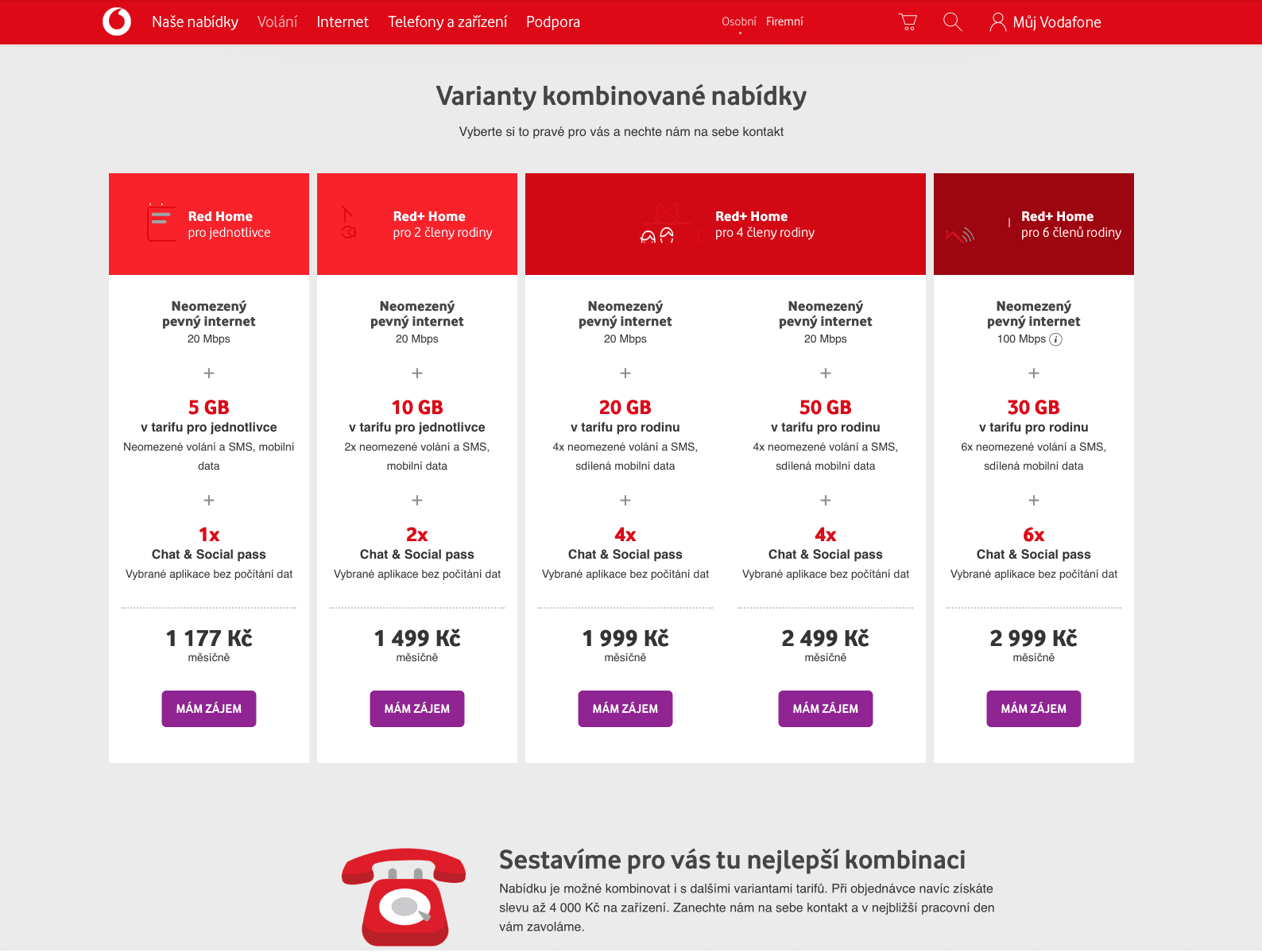
None of the predefined bundles felt like their bundle. The original page offered four pre-defined family packages side by side. But families don't come in same shapes — they come in dozens. A household with two adults and one teenager looking at a "family of four" column had to mentally subtract a broadband and guess what the price would be. A single parent with two kids saw nothing labeled for them at all. When customers can't find themselves in the offer, they don't convert — they leave.
The savings story was buried. The offer's core value was a real one: bundling mobile plan and home internet meaningfully reduced the monthly cost compared to buying them separately. But that saving was implicit in the pricing table, not stated. Customers had to compare the bundled price against the prices of standalone products they'd have to look up on other pages — and then do the math themselves.
Static examples killed the sense of flexibility. Vodafone's offer was genuinely flexible — number of the SIM cards with different plans, internet speed and TV plan all adjustable. But on the page, that flexibility was represented by four static configuration examples. A customer reading them couldn't tell whether they were looking at the four options or four examples of many.
Before / After
The Process
How might we turn a static pricing table into a flow customers actually convert on — without losing the depth of the offer?
Iteration 1
Static Pricing
Four pre-defined bundles, no interactivity.
0.4% CR
Iteration 2
2-Page Walkthrough
Interactivity bolted on — but split from the page.
1.2% CR

Iteration 3
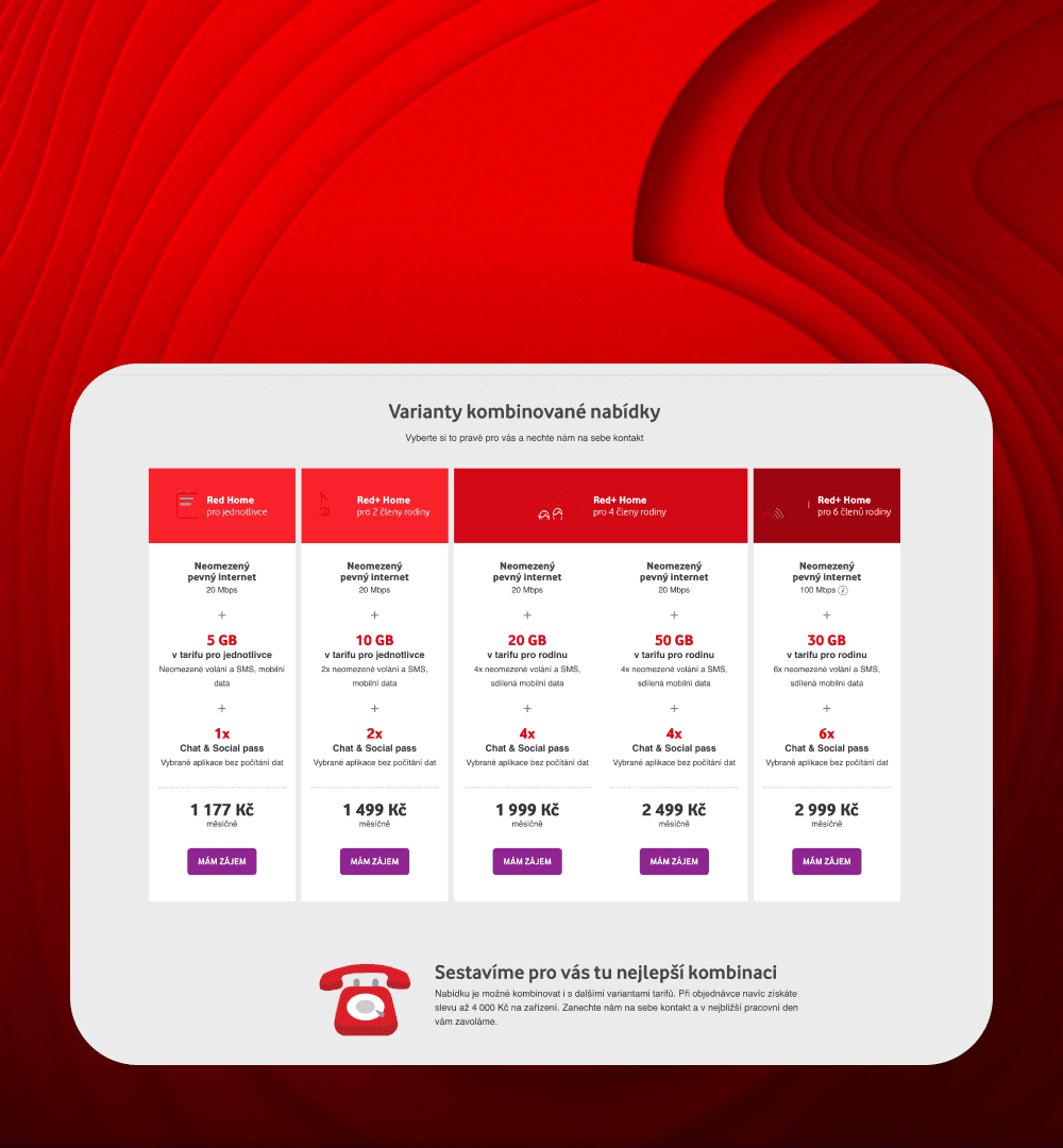
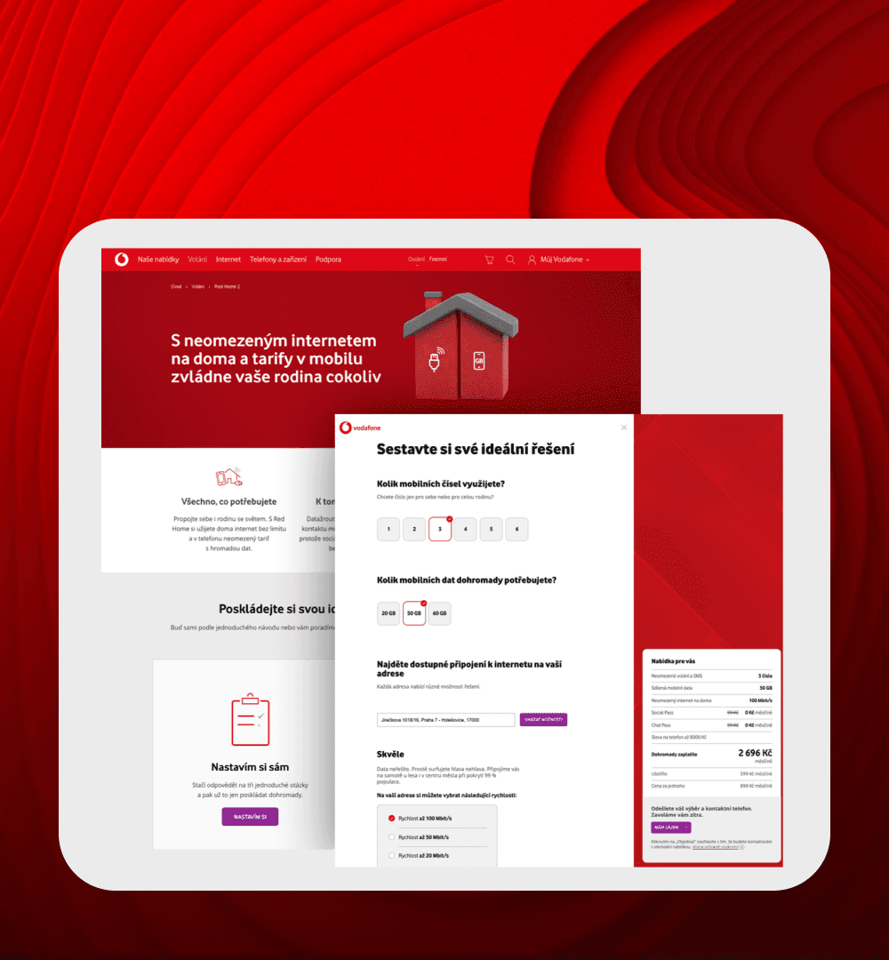
One-Page Walkthrough
Land on offer page, scroll benefits, click "Customize" to launch a modal. Address verification gated behind the CTA.
1.18% CR

Final Design
One-Page Shopping Experience
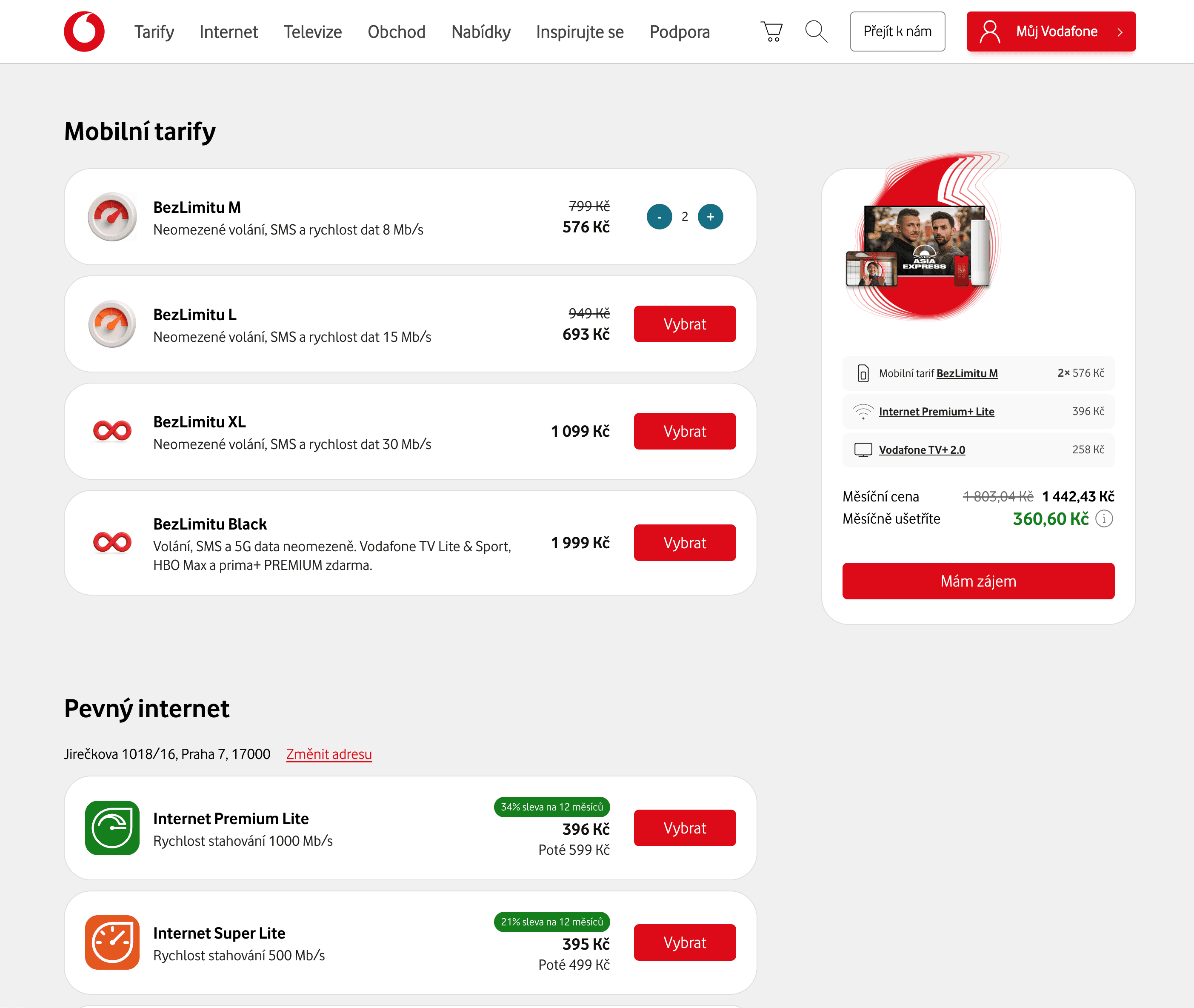
Configurator lives directly on the page. Address, options, live pricing — all visible at once. The page is the configurator.
1.86% CR
“ Ladislav prepared data insights, the redesign concept, and a new web information architecture. He project-managed the entire web redesign and established foundation of design system. He definitely helped us go the extra mile in shaping our online strategy! ”

Vladimír Staněk
Digital & Online Sales Lead
Results
Conversion to the Lead creates a lot more sales.
5
+
Design Iterations
57
%
First Iteration Uplift
365
%
Overall Conversion Uplift

Web conversion optimization at Vodafone
A multi-iteration CRO rebuild of Vodafone's multi-product offer landing page — behavior data, sharp UX choices, and A/B testing to multiply revenue from a single page.
Client
Vodafone
Year
2020
Industry
Telecommunication
Role
Lead Designer
Challenge
Vodafone's multi-product landing page sold one of the company's most strategic offers — a converged bundle of mobile plans, home internet and paid TV for families. But the page was doing the heavy lifting badly.
My Role
I led the CRO and UX work end-to-end, partnering with engineering and analytics.
Defined the hypothesis and variation design for the A/B test and executed, decided & planned the future roadmap of upcoming improvements and design changes.
I also analyzed heatmaps, scrollmaps, and session recordings to validate behavior beyond the conversion metric.
Result
+365% conversion rate uplift measured against the original static-table baseline design compared to the latest calculator-like design.
A/B test iterations
A/B test uplift.
99% confidence.
Conversion rate uplift over all iterations.
Challenge
There were a few challenges that needed to be reflected in design.
None of the predefined bundles felt like their bundle. The original page offered four pre-defined family packages side by side. But families don't come in same shapes — they come in dozens. A household with two adults and one teenager looking at a "family of four" column had to mentally subtract a broadband and guess what the price would be. A single parent with two kids saw nothing labeled for them at all. When customers can't find themselves in the offer, they don't convert — they leave.
The savings story was buried. The offer's core value was a real one: bundling mobile plan and home internet meaningfully reduced the monthly cost compared to buying them separately. But that saving was implicit in the pricing table, not stated. Customers had to compare the bundled price against the prices of standalone products they'd have to look up on other pages — and then do the math themselves.
Static examples killed the sense of flexibility. Vodafone's offer was genuinely flexible — number of the SIM cards with different plans, internet speed and TV plan all adjustable. But on the page, that flexibility was represented by four static configuration examples. A customer reading them couldn't tell whether they were looking at the four options or four examples of many.
Before / After
The Process
How might we turn a static pricing table into a flow customers actually convert on — without losing the depth of the offer?
Iteration 1
Static Pricing
Four pre-defined bundles, no interactivity.
0.4% CR
Iteration 2
2-Page Walkthrough
Interactivity bolted on — but split from the page.
1.2% CR
Iteration 3
One-Page Walkthrough
Land on offer page, scroll benefits, click "Customize" to launch a modal. Address verification gated behind the CTA.
1.18% CR
Final Design
One-Page Shopping Experience
Configurator lives directly on the page. Address, options, live pricing — all visible at once. The page is the configurator.
1.86% CR
“ Ladislav prepared data insights, the redesign concept, and a new web information architecture. He project-managed the entire web redesign and established foundation of design system. He definitely helped us go the extra mile in shaping our online strategy! ”
Vladimír Staněk
Digital & Online Sales Lead
Results
Conversion to the Lead creates a lot more sales.
5
+
Design Iterations
57
%
First Iteration Uplift
365
%
Overall Conversion Uplift